

About Base UI
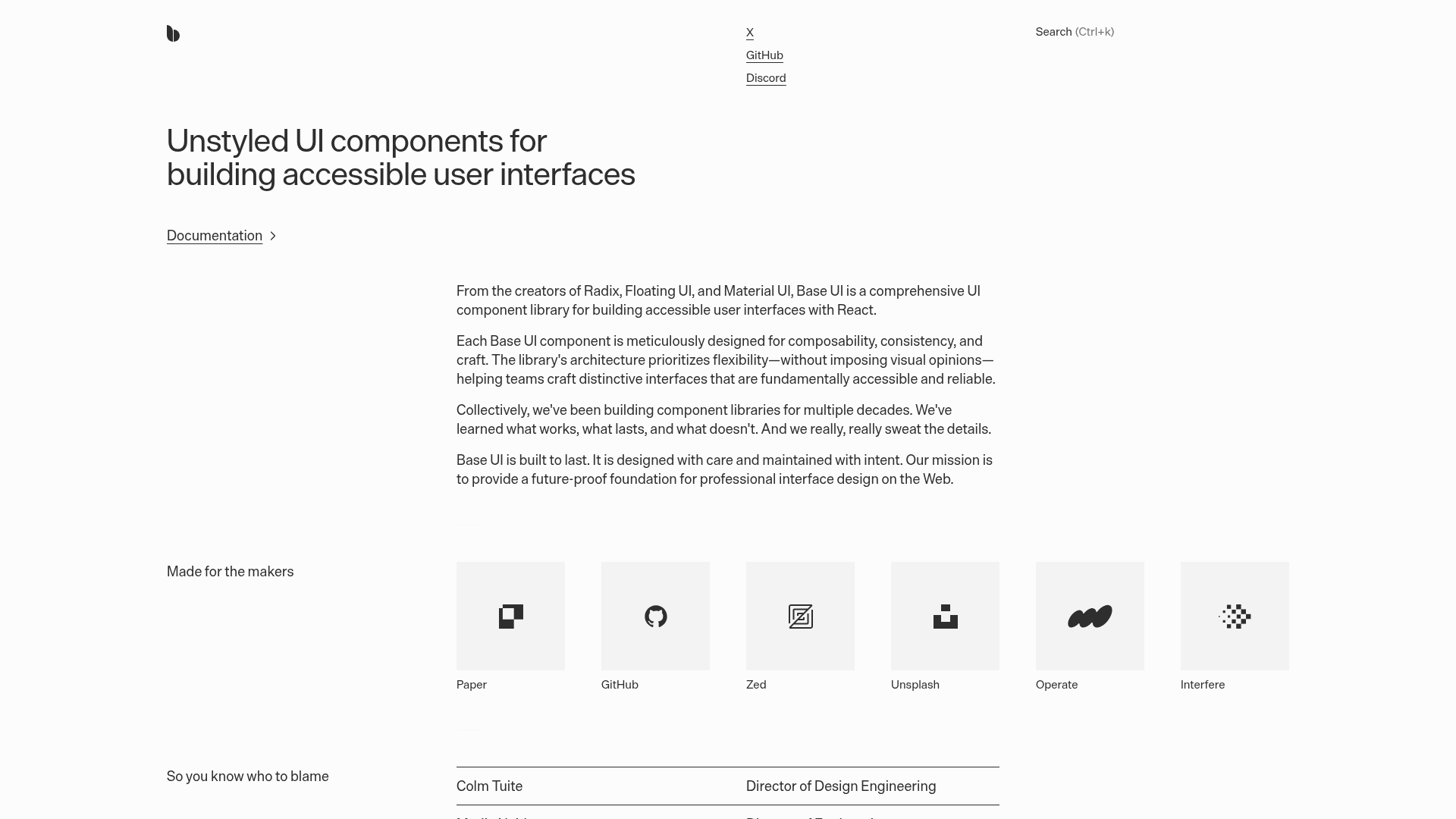
Base UI is a React library of unstyled UI components for building accessible interfaces and design systems. It serves teams that want to implement their own visuals while maintaining strong accessibility and reliability, providing a future-proof foundation for professional web apps.
Key Features
Base UI is a React library of unstyled UI components designed for accessible UI systems and design tokens. It helps teams build apps and design systems with a flexible, code-first foundation:
Unstyled, highly configurable components
designed to be composed and customized without enforcing visuals, helping teams implement their own design system while preserving accessibility.
Styling compatibility
works with Tailwind, CSS Modules, CSS-in-JS, plain CSS, and any animation library; the library itself does not bundle CSS and does not prescribe a styling solution.
Advanced components and accessibility
includes Combobox and Autocomplete, with input scrubbing, nested dialogs, and hover-activated menus; follows ARIA patterns and WCAG 2.2; tested across browsers.
Active maintenance and licensing
actively maintained by a dedicated team; React-only library under MIT license with free commercial use.
Summary
Best for design-system teams, React-focused frontend engineers, and organizations needing accessible UI components in web apps.
